Recently upon shooting the last frame of a roll of Kodak Ektar 100, I put a roll of Ilford HP5 Plus — my second roll of HP5 Plus, and my third roll of black and white film — into my Pentax K1000 and began shooting. After about five shots, I realized that I hadn’t adjusted the camera’s ASA setting, so I had overexposed those five shots by about two stops. When I received the prints back after processing, the subject matter of those first five shots was distinct and clear despite the overexposure. They had noticeably more grain than the other shots, but that was their primary deficiency.
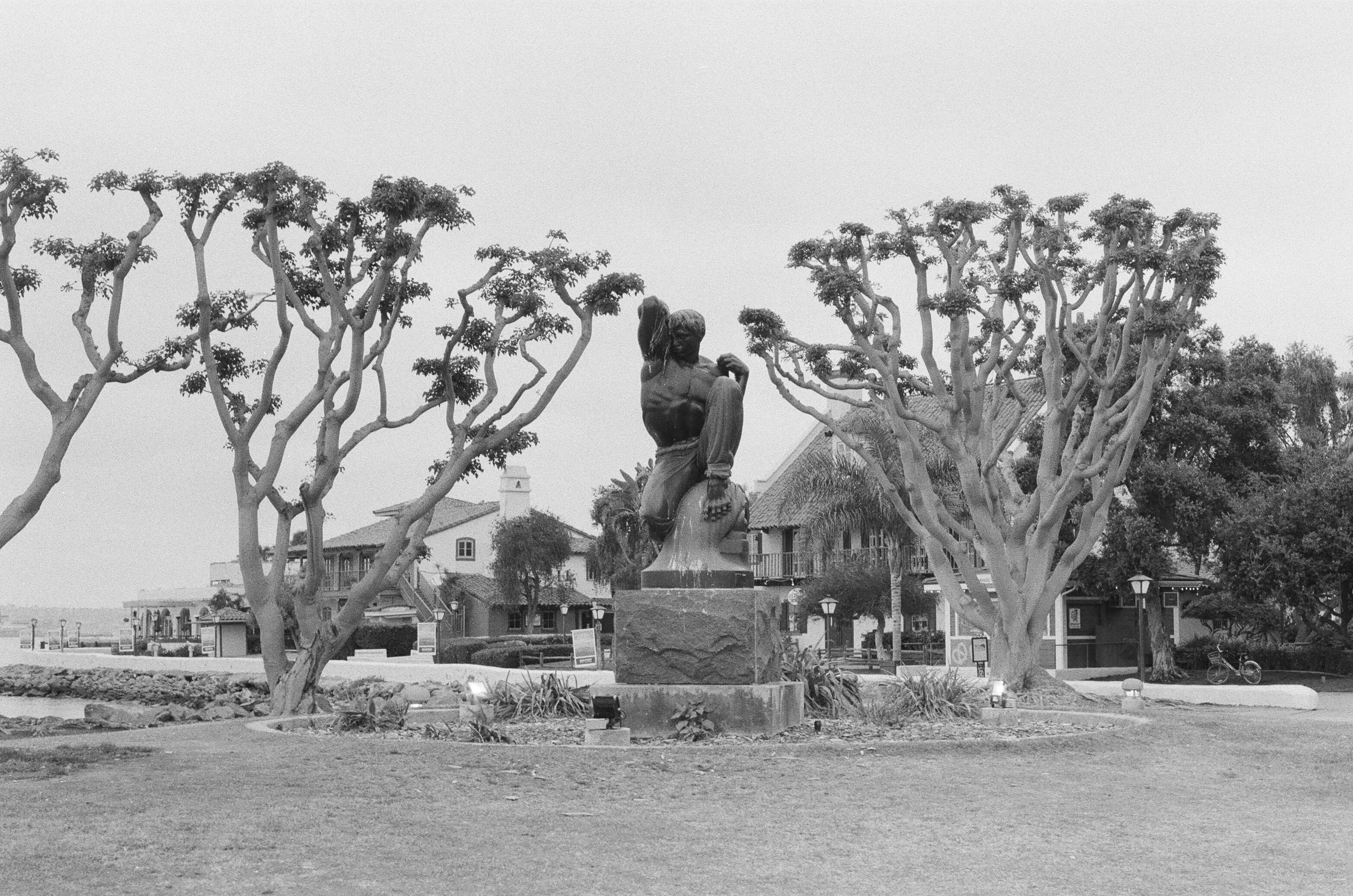
I underexposed another shot in the roll by about two stops. A boat was going by, carrying passengers from downtown San Diego to Coronado. A marker post and a dock were nearby, and I thought it would be an interesting composition if I could line them up to point at the boat. Time was short, however, since the boat continued moving along as I tried to sort out the scene. In my rush, I screwed up both the metering and the composition. I needed about two stops more light in the camera, and I needed to be up a little higher. Nonetheless, the film did its job, and despite a little extra grain, the scene came out clear. You can count the windows in the buildings across the bay, if you so desire. Apparently, Ilford’s HP5 Plus is pretty generous about exposure. I don’t know yet whether — or to what degree — other black and white films are so generous.

As for the properly exposed shots, what can I say? I have been very pleased with the results. Upon receipt of the first set of prints, I was sold on black and white photography. I won’t be shooting black and white exclusively, but I’ll generally keep a roll of black and white on hand.
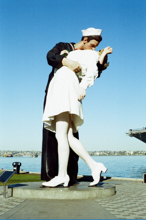
I grew up in a world of color. Between color film, color TV, and color computers, color was the norm. Even old black and white movies were occasionally colorized, though I realized early on that the colorization rarely added much, if anything, to the enjoyment of the movie. As I was growing up, I was exposed to monochrome computers, which were still in use in schools. I enjoyed the green and black screens of the old Apple IIe computers. I also enjoyed some old black and white TV programs. I even enjoyed the occasional black and white photograph. But color was the standard, and I never took black and white too seriously. That attitude was changing slowly, but my interest in film photography was a catalyst that made an abrupt and immediate difference.
Color adds a lot to certain photographs. But color can also be a distraction. It can influence where your attention is directed in a photograph, and it sometimes does so in good ways, and sometimes in bad ways. Occasionally it’s nice to take away that distraction and force the viewer to consider other attributes of the elements in the photograph. And sometimes it’s good for the photographer to take a moment and compose a photograph with the different considerations that black and white imposes. You might benefit by asking yourself, upon seeing a black and white photograph, what color would add to it. Maybe the photograph would benefit from being in color. I think the conclusion will often be that color wouldn’t add anything substantial, and, in fact, that the photograph would lose some of its charm if it were in color. I confess that I have a photograph or two that I wish I had taken in black and white. Sure, I could convert it to monochrome in Photoshop (or the Gimp), but it wouldn’t be the same. Besides, I generally avoid making material changes to my photographs on the computer.
I like color. As I stated above, I will continue photographing in color. But black and white will also be part of my repertoire from now on.